Get in touch
"Inhousecodes is a software development company that builds custom websites, apps, and digital tools for businesses.
Client
Start Date
inhousecodes software company Website UX Design
Case Study
The Project
Inhousecodes is a software development company committed to transforming ideas into robust and scalable digital solutions. They offer the following services custom software development, web application development, mobile app creation (iOS and Android), and ongoing maintenance and support. Their agile approach ensures transparent collaboration, iterative progress, and the delivery of high-quality software that aligns perfectly with your business objectives. They understands their client needs and use the latest technologies to build innovative and efficient solutions for their clients.
The problem
The problem I'm trying to solve is effectively communicating the value, benefits, and unique selling proposition of the tech software company's innovative solutions to potential clients, establishing credibility and trust, generating quality leads, and differentiating ourselves from competitors through a website that showcases our expertise, services, portfolio, and success stories in a clear, concise, and compelling manner, while also addressing the specific needs and pain points of our target audience.
The Goal
Business goal : The business goal is to drive growth, increase revenue, and establish the tech software company as a trusted company in the industry by creating a website that effectively communicates value, generates quality leads, and showcases expertise and solutions to potential clients.
User goal : The user goal is to find a reliable and tech software solution that meets their specific needs, understands their pain points, and provides valuable insights and support, while easily navigating the website to learn about services, features, and success stories.
Understanding the problem
The problem involves understanding the challenges and pain points clients face in finding reliable and trusted tech software solutions that meets their specific needs, overcome obstacles, and establish trust through communication, user-friendly interfaces, and credible expertise. Here's my breakdown on how I understood the problem:
Difficulty finding relevant, concise, and up-to-date information : Users struggle to find the information they need, details about the services, features, or solutions, due to poor organization, inadequate search functionality, or outdated content, leading to frustration and a negative experience.
Complex navigation with unclear menu structures : Users find it hard to navigate the website, leading to frustration and confusion due to unclear menu structures, too many clicks to find relevant information, or lack of clear calls-to-action.
Lack of clear and compelling value proposition with unique selling points : Users do not understand the unique benefits, value, and competitive advantages offered by the software development company, making it difficult for them to differentiate it from competitors and decide whether it's the right fit for their needs.
Trust and credibility issues due to lack of communication channels and reviews : Users question the company's expertise, reliability, trustworthiness, or experience, hindering their decision to engage with the services, due to lack of transparency, unclear communication, insufficient showcase of credentials and absence of customer testimonials and reviews.
User Persona
I started by creating a user persona for Emily showing her characteristics as a Sales Manager in the finance industry , she wants to find a reliable software development company that will design and develop a website for her business to increase sales.
Persona 1: Emily

User Research summary
The user research summary provides an overview of the needs, goals, and pain points of the target users, including developers looking for jobs, IT professionals looking for reliable software development partners, and clients looking for software solutions.
Problem statement
The problems the company faces is meeting varied needs of their users which includes clients looking for software solutions that meet their specific business needs, IT professionals searching for reliable and skilled development partners which results in a poor user experience, low engagement ands missed business opportunities and lost revenue potential."
The user journey map
A user journey map for a client looking for a software development website
Awareness : Client recognizes the need for custom software development.
Research : Client searches online, asks for referrals, and reviews potential companies.
Evaluation : Client assesses companies' portfolios, case studies, and testimonials.
Shortlisting : Client narrows down options based on expertise, experience, and fit.
Contact : Client reaches out to shortlisted companies for quotes or consultations.
Proposal : Client reviews proposals, comparing scope, timeline, and budget.
Decision : Client selects a company and initiates project discussions.
Onboarding : Client works with the company to define project scope, goals, and timelines.
Development : Client receives regular updates, provides feedback, and iterates on the project.
Launch : Client reviews and launches the final product.
Post-Launch : Client receives support, maintenance, and potential future development.
Pain points might include:
- Difficulty finding trustworthy companies
- Uncertainty about technical capabilities
- Concerns about project timelines and budgets
- Challenges in communicating technical requirements
starting the design
paper wireframes

I created this paper wireframe by sketching a basic layout and structure on paper, visualizing the platform's overall architecture, user flow, and core foundation for subsequent design and iterative development.
Digital wireframes

I created a digital wireframe by:
Choosing a tool : I used figma in creating the wireframe
Designing the layout : I created a detailed layout of the website's , including headers, footers, navigation, and content sections.
Adding interactive elements : I created components like buttons, forms, and links to simulate user interactions.
Testing user flows : I tested the wireframe to ensure navigation and identify potential issues.
Refining and iterating : I made adjustments based on feedback and testing results.
This digital wireframe served as a blueprint for the website's design, allowing me to understand the concept before moving to high-fidelity design and development.
Low-fidelity prototype

I designed a low-fidelity prototype in Figma, such as the landing page, contact us page, our services page and other pages . This clickable prototype was then tested, providing valuable insights into usability and relevance to the user needs through initial feedback.
Usability studies

I conducted usability studies by:
Defining the objectives : I identify how users interact with the website.
Determine the target users : I selected participants who resemble real clients, such as startup founders or product managers.
Create realistic task scenarios : That reflect common user goals like finding services or submitting a project inquiry.
Choose testing method : Deciding between moderated (live) or unmoderated (self-guided) usability testing.
Conduct the usability sessions :Observing users as they complete tasks and listening to their feedback.
Analyze the results : By identifying patterns, usability issues, and areas where users struggled or got confused.
Report findings : By summarizing key problems, their impact, and recommending design improvements.
Refine the design and re-test : To ensure that the changes improve the user experience and solve the original issues.
This process helped me understand user behavior, identify usability issues, and inform design decisions to create a more user-friendly and effective website.
Design iterations

I improved the design through iterations, making improvements such as:
Streamlining navigation : Simplifying menus and categorization.
Enhancing content discovery : Improving search functionality and resource organization.
Optimizing layout : Adjusting spacing, typography, and visual hierarchy.
Improving responsiveness : Ensuring seamless user experience across devices.
These iterations enhanced the website's usability, accessibility, and overall user experience, creating a more engaging and effective platform for the website
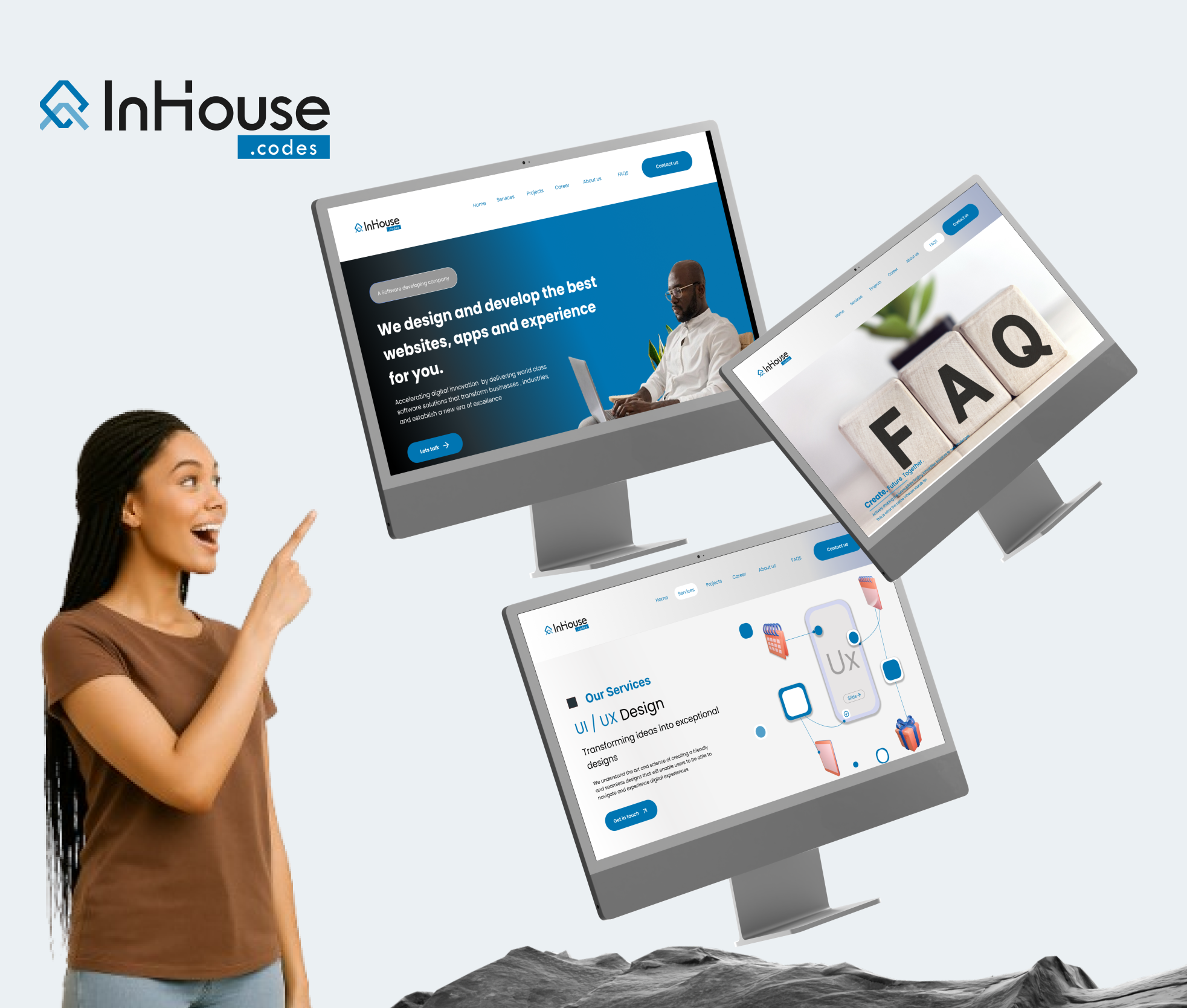
Mockups and high-fidelity prototype

The high-fidelity prototype for this website was designed and prototyped in figma for easy flow, it was sent out for usability's studies at this point , was designed with a modern color palette, Blue, black and whites for a clean, user friendly interface in headers and other pages, blue for call-to-action buttons. Interactive elements, such as navigation menus, search bars, and buttons, were refined for intuitiveness and responsiveness. The prototype was prepared for usability studies and responsiveness.


Accessibility considerations

Some key accessibility considerations maintained and considered in this website;
Color Contrast : Ensuring sufficient contrast between text and background colors to aid users with visual impairments.
Screen Reader Compatibility : creating headings, labels, and text for images to help users with color blindness and eye problem navigate through the website easily .
Responsive Design : Ensuring the site adapts to different screen sizes and devices, benefiting users with varying abilities and preferences.
Clear and Consistent Navigation : Organizing content in a logical and predictable manner to help all users find information easily.
Closed Captions and Transcripts : Offering captions for video content and transcripts for audio content to assist users who are deaf or hard of hearing.
These considerations help make the tech website more inclusive and usable for a wider audience.
Results and Takeaways
Here are the potential results and takeaways:
Results:
Improved User Experience : The high-fidelity prototype received positive feedback from users, because of its intuitive navigation and modern design.
Enhanced Accessibility : The accessibility considerations ensured that the website is usable by a wider audience, including users with disabilities.
Takeaways :
User-Centered Design : Prioritizing user needs and feedback led to a more effective and engaging website design.
Accessibility Matters : Incorporating accessibility considerations from the begining ensured that the website is inclusive and usable by a broader audience
These results and takeaways can inform future design projects, highlighting the importance of user-centered design, accessibility, and collaboration.
Your email address will not be published. Required fields are marked *